This is Part 3 of Blood Work, and the first part of a subseries called The Extraction: what it actually takes to get your medical record out of the institutions holding it. Part 2 was the census, the twelve-row table of who has what.
Part 2 ended with a tidy plan of attack: twelve health systems, four access patterns, and a mental budget of several months for the paper chase. I said the next part would be where that plan collided with half a dozen MyCharts, two dead portals, a phone tree, and the postal service.
It collided. Just not the way I expected. The plan did not turn out to be too optimistic. It turned out to be aimed at a map that was wrong in both directions at once.
The plan was to open one portal and see
I built the census from my inbox. Ten years of appointment reminders, results notifications and post-visit surveys across two mailboxes, sorted into a twelve-row table of institutions, date ranges, and how each one expects you to get your data back. It was careful work, and it was the best available answer without logging in anywhere.
It was also, as it turns out, an answer built entirely from the outside. Every row was inferred from what an institution had emailed me, which is a bit like mapping a city by reading its junk mail.
So the first real step was cheap and obvious: before sending a single records request, log into everything and look. Records requests take thirty days by law and often longer in practice. Portal checks take an afternoon. Doing the slow thing first, on rows that might not even exist, is how projects like this die.
Twelve became seven in about four hours
The first thing to go was UW Medicine. My census had it as row nine, a separate system with its own portal and its own records request. It is not a separate system. mychart.uwmedicine.org and the Fred Hutch portal are the same Epic tenant, co-branded. One login, one record, one export. Two rows became one.
Then The Everett Clinic, row eleven, flagged "confirm or strike." It is not a health system either. It is a brand inside Optum Care Washington, sharing a tenant with The Polyclinic and Sound Family Medicine. The portal's own department filter lists all three. Three rows became one.
Which left row twelve, the one I had been quietly dreading: pre-2016 primary care. A clinic I could not name, from before I had any reason to pay attention, holding whatever baseline blood work existed before the diagnosis. I had it budgeted as the hardest item in the project. Identify the clinic, find out who acquired it, write to a health information management department that may or may not still have the records, wait.
It was The Polyclinic. Which is Optum. Which I was already logged into. The pre-2016 results were sitting in a portal I had open in another tab, under the same physician, Dr. Gregory Sharp, whose name is on results from years I did know about.*
The hardest projected item in the project took about ninety seconds to close, and it closed by discovering it had never been a separate item at all.
Twelve rows became seven organizations: Providence Swedish, Fred Hutch with UW Medicine, Optum Care Washington, MultiCare, Adaptive's clonoSEQ, Labcorp, and one ZoomCare visit in Portland.
Epic agreed, which is the part I did not expect
Partway through this, on a hunch, I logged into MyChart Central. It is Epic's cross-tenant identity layer, central.mychart.org, and it exists so that patients with records in multiple Epic organizations can sign in once and jump between them.
It listed five linked accounts. Optum Care Washington. MultiCare Health System. Providence Health and Services Washington and Montana. Fred Hutchinson Cancer Center. Plus the hub itself, viewed from inside clonoSEQ, which is a sixth Epic tenant wearing a specialty coat.
UW Medicine does not appear, because it is the Fred Hutch tenant. The Everett Clinic does not appear, because it is Optum. The Polyclinic does not appear, for the same reason.
Every merge I had just argued for from indirect evidence, Epic's own account list confirmed independently. That is a rare thing in a project like this. Usually you consolidate a messy dataset and then spend a long time wondering whether you consolidated it correctly. Here the vendor showed me its answer and it matched mine.
It is worth being precise about what MyChart Central does and does not do, because the name oversells it. It unifies access, not data. Each tenant still has its own record, its own FHIR endpoint, and its own OAuth handshake. It is single sign-on, not an aggregator. Convenient, genuinely useful, and it does not save you a single export.
The record starts in 2009
Here is the part I did not see coming at all.
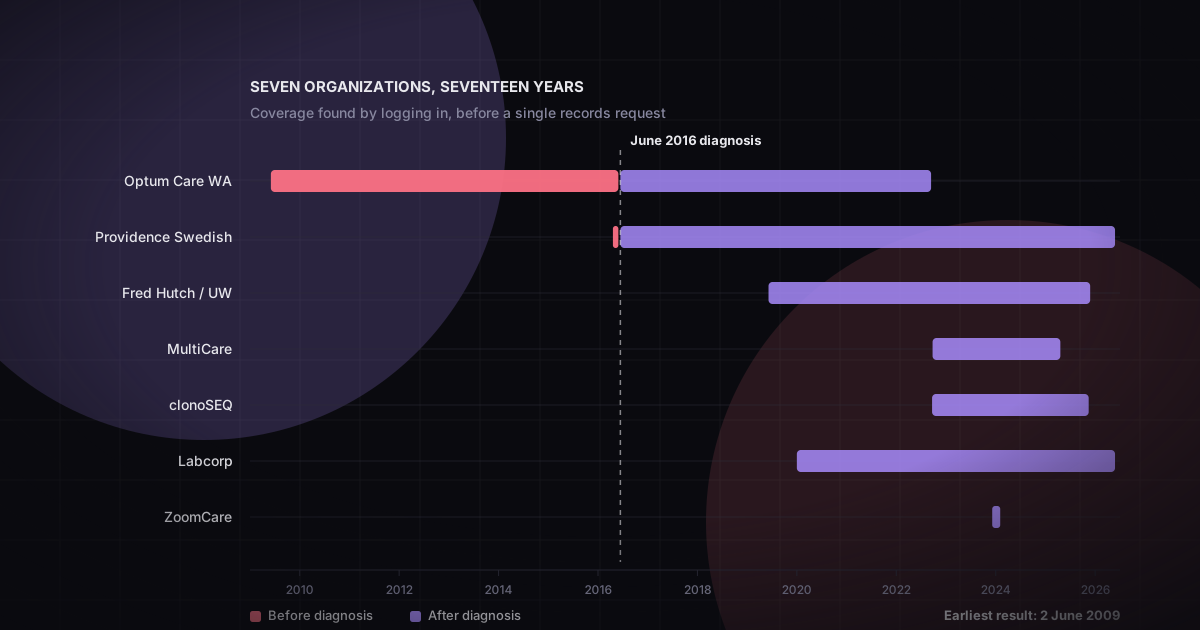
The census said ten years, anchored on the June 2016 diagnosis and running forward. Part 1 is titled "Ten years of blood draws." That number was wrong, and wrong in the direction you want.
Optum's earliest result is dated June 2, 2009. A comprehensive metabolic panel. Sodium, 139.
Seven years before anyone said the word leukemia to me. A routine draw at a primary care clinic, filed and forgotten, sitting in a portal that has since been through a corporate acquisition and now carries a different name. Still there. Still structured. Still carrying its reference ranges and its performing lab.
Providence turned out to reach further back too. My census had it starting December 2020, because that is where the email trail started. The portal shows April 20, 2016: a CBC ordered by Greg Sharp, MD, two months before the diagnosis. That is the last normal-looking blood count I have, and I did not know I had it.
So the dataset is not ten years of illness. It is seventeen years, with seven years of baseline in front of the diagnosis and a CBC from eight weeks before everything changed.
For a leukemia dataset, pre-diagnosis baseline is not a nice extra. It is the control. Every abnormal value after June 2016 is only interesting relative to what normal looked like for me specifically, and I now have seven years of that. The thing I assumed I would have to fight for turned out to be the thing quietly waiting.†
The mistake worth publishing
I got one of these badly wrong, and the way I got it wrong is more useful than the correction.
ZoomCare was row ten, "confirm or strike." I searched my mail for it and got 38 messages, all of them marketing. No appointment confirmations, no results, no post-visit anything. I wrote it up as a confident finding: no clinical trail, strike the row.
That was wrong. There is a real ZoomCare visit, December 31, 2023, at the NW 23rd Clinic in Portland, with a PA named Wa Chan. The confirmation email exists. The post-visit survey exists. The welcome mail exists.
My search window started in January 2024. The visit was eight days earlier.
The rule I took from it, now written at the top of the source document where the next person will hit it: a negative finding is only as good as the range it covered. Not "I searched and found nothing." Only ever "I searched this range and found nothing," with the range stated out loud, because a bounded search that returns zero results looks exactly like a thorough search that returns zero results. Nothing in the output distinguishes them. You have to go back and check the bounds every time, and I did not.
The mistake that better searching cannot fix
MultiCare is the same shape of error with a completely different cause, and the distinction matters more than either individual mistake.
My census had MultiCare starting October 2024, derived, again, from the email trail. The portal shows a visit on September 22, 2022: right knee and tibia-fibula X-rays after an injury, under Mica Crisp, ARNP.
That visit left no email trace whatsoever. Not one I missed, not one outside my search window. None was ever sent, because my MyChart account there did not exist until October 2024 and there was nothing to notify.
Two failure modes that produce identical symptoms:
- ZoomCare: the mail existed, my search missed it. Fixable by searching properly.
- MultiCare: the mail never existed. Not fixable by searching better at all.
Which means every date range I derived from email is a lower bound, not a range. The inbox is a good audit log of your relationship with an institution's notification settings. It is a poor audit log of your care. Portal enrollment postdates care, sometimes by years, and everything before enrollment is invisible from the outside no matter how good your search is.
Where that leaves the plan
The records-request pile went from five firm items to two: Adaptive, for the clonoSEQ years that predate their portal, and Fred Hutch, for the retired Caresi-era system. The ZoomCare visit needs one too, since it predates their migration to a new EHR by nine months and is invisible in the portal that replaced it. Everything else turned out to be reachable by logging in.
clonoSEQ deserves its own note. The portal holds ten minimal-residual-disease results, September 2022 through November 2025. I am fairly confident my first clonoSEQ test was June 2016, at diagnosis, which would put roughly six years of the most sensitive measurement in the dataset outside the portal entirely. That request is sent. The thirty-day clock is running.
And with seven doors open instead of twelve, I did the obvious thing and asked all four Epic tenants for a complete export of everything they hold.
888 documents came back. 288 megabytes.
That is where Part 4 goes, because the exports contained a surprise of their own, and unlike this one it is not a happy one. The document each system hands you when you ask for your record is not your record, and it does not tell you what it left out.
Notes
- Provider names appear in this series as they appear in my records. They are clinicians who treated me, not characters. Where a name shows up it is because the record is more useful when it is specific, not because anyone is being singled out.↩
- The census in Part 2 stays exactly as published. It was an accurate account of what I believed in July 2026, built with the best evidence available at the time. Correcting it in place would erase the only interesting thing about it, which is that a careful inventory built from good evidence was still wrong in both directions.↩