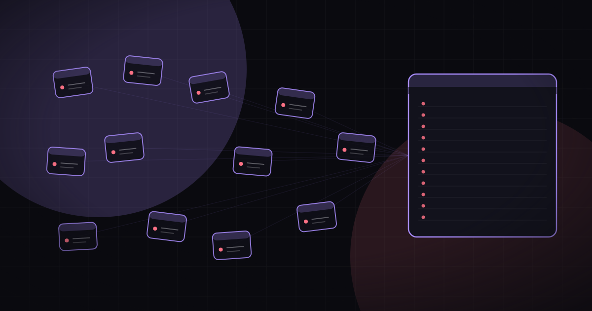
This is Part 2 of a series about using AI to reclaim, normalize, and actually learn from a decade of my own blood work, scattered across a dozen health systems. Part 1 covered the why. This part is the census: finding out where the data actually lives.
In Part 1 I admitted something a little embarrassing: I could not have told you how many health systems were holding my blood work. Asked to list every place that had ever put a needle in my arm, I'd have confidently said six, maybe seven, and I'd have been wrong about which six.
So before extracting a single lab value, the project needed a census. Not "what are my results," but the question sitting underneath it: who has results about me at all, from which years, and how does each one expect me to get them back out?
The honest answer turned out to be about a dozen. Here is how I found them, what each one holds, and the four and a half ways they'll let me have my own data.
The inbox is the audit log
Here's the trick that made this step almost free. For a decade, every health system I've touched has been quietly announcing itself in my email. Not with data (thankfully; that would be its own HIPAA article), but with metadata. "You have a new test result." "Welcome to MyChart." "Your statement is now available." "We're moving to a new records system."
Individually these emails are noise. I've deleted thousands of them. Collectively they are an audit log of my entire medical life, timestamped.
So the first real AI task of this project wasn't parsing a lab PDF. It was handing Claude my Gmail and asking it to enumerate every sender that had ever notified me about a test result, a portal account, an appointment, or a medical bill, and to note the first and last date each one appeared.
One detail mattered more than I expected: I have two mailboxes. A current address, and an older Gmail I stopped using years ago but can still search from the same account. My diagnosis was June 2016, and the notifications from those first, hardest years, induction and transplant and the stretch I remember least, had all gone to the old address. A search of my current inbox alone would have quietly amputated the worst and most important years of the record. Sweeping both is what reached back to 2016.*
What each system holds, and the years it covers
Names are real, because this series is more useful when it's specific.
The two densest sources are the same institution twice. Treatment started at Swedish in June 2016, and the surprise of the census was that Swedish's original portal was a different system entirely, MyOnlineChart.org, which stopped sending me anything around late 2020. Then Providence Swedish MyChart picks up and runs to today. That gap is a portal migration: same hospital, new records system, and an open question about whether the 2016 to 2020 treatment-era history came forward with it. The densest, highest-stakes data I have lives behind the portal Swedish used to run.
The cancer center is the same story. Before 2021, Seattle Cancer Care Alliance ran a portal called Caresi. It retired at the MyChart cutover, and then SCCA itself became Fred Hutch. The transplant-era results, the ones from the part of this I remember least, predate the portal that exists today.
Then there's the outlier that no hospital portal knows about. My minimal-residual-disease testing, the assay that actually tracked the leukemia at the molecular level, ran through Adaptive Biotechnologies' clonoSEQ, on Adaptive's own portal, not any hospital's MyChart. It is some of the highest-value data in the whole project, and if I'd trusted my hospital logins to be complete I'd have missed it entirely.
The rest fill in the routine and the edges: Labcorp for a stretch of standalone draws; The Polyclinic, now Optum Care Washington, which did its own records-system migration in 2021; MultiCare more recently; and UW Medicine, which I'm nearly certain drew my blood but which left almost no email trace, so it needs confirming by hand. Three more are soft: ZoomCare and an Everett Clinic entry that each surfaced from a thin signal and may not have drawn blood at all, plus a pre-2016 primary care clinic that holds my only pre-diagnosis baseline and whose name I still have to dig up. A census needs exclusion criteria as much as inclusion. I already threw out a family member's pediatric portal and a durable-medical-equipment supplier that just emails receipts. A dozen is the count after the noise came out, and even that number has soft edges.
The single loudest fact in the whole list: MyChart is not one thing. Providence Swedish, Fred Hutch, Optum, MultiCare, UW eCare, and even Adaptive's clonoSEQ all run on Epic MyChart. That's half a dozen separate MyChart accounts, each its own login, each its own patient identity for me, none of them showing the others' data. Same software vendor, no shared view. When someone asks why patients are confused about their own records, show them that sentence.
Export options
The census didn't just list systems. It sorted each one into how it expects a patient to get data back out. There are only about four and a half patterns:
- FHIR API. Every live Epic MyChart is required, under the 21st Century Cures Act, to expose a patient-access FHIR endpoint. It's the only route that returns structured results: each lab as a coded observation with a LOINC identifier, a value, units, and a reference range, instead of a PDF I have to re-parse later.†
- Portal download. For any live MyChart where the API fights back, and as the primary route for Labcorp, there's the manual export. Epic's "Download My Record" produces a C-CDA bundle of, in theory, everything.
- Blue Button. The patient-facing "download my data" standard that grew out of the VA and Medicare. Where it exists it's a cousin of the portal export, a one-click "give me a file," and it's worth checking for before falling back to a formal request.
- Records request. The formal HIPAA right-of-access letter (§ 164.524) to a Health Information Management department. This is the only route for retired portals and pre-migration years. It runs on a 30-day clock.
- Snail mail. Not a different right, just the delivery mechanism at least one of these institutions still insists on in 2026: the records request, on paper, in an envelope, with a stamp.
Sorted against those routes, the full census looks like this:
| # | System | Years covered | Platform | Access route | Structured? |
|---|---|---|---|---|---|
| 1 | Providence Swedish (current) | 2020-present | Epic MyChart | FHIR API | Yes |
| 2 | Swedish, legacy (MyOnlineChart) | 2016-2020 | Epic (retired) | Records request | Maybe |
| 3 | Fred Hutch / SCCA (current) | 2021-present | Epic MyChart | FHIR API | Yes |
| 4 | SCCA "Caresi" (retired) | pre-2021, transplant era | legacy (gone) | Records request | No |
| 5 | Adaptive clonoSEQ | 2021-present | Epic MyChart (specialty) | Vendor phone, then portal | Yes, if it opens |
| 6 | Labcorp | 2020-2022 | Labcorp portal | Portal download | Partial |
| 7 | The Polyclinic / Optum Care WA | pre-2021 and current | Epic MyChart (Optum) | FHIR (current) + request (pre-2021) | Recent only |
| 8 | MultiCare | 2024-present | Epic MyChart | FHIR API | Yes |
| 9 | UW Medicine (eCare) | older, unconfirmed | Epic MyChart | FHIR + records request | Recent only |
| 10 | ZoomCare | 2024 | proprietary app | Portal check, then request | Unknown |
| 11 | Everett Clinic (Optum) | 2024 | Epic MyChart (Optum) | likely the same instance as #7 | Unknown |
| 12 | Pre-2016 primary care | pre-diagnosis baseline | unknown | Records request (paper) | No |
Read that "Structured?" column top to bottom and you can already see the shape of Part 3. Roughly half of this data can, in principle, arrive as clean coded values. The other half is going to show up as documents, and the oldest and most important years are the ones least likely to come out structured at all.
The portal-migration trap
Look at how many systems appear in that table with two answers.
Three institutions changed portals underneath the same, unbroken care relationship: Swedish went MyOnlineChart to Providence MyChart, SCCA went Caresi to MyChart and then renamed to Fred Hutch, and Optum did its own records-system migration in 2021. In every one of those cases the live login only reaches the current system. The pre-migration history sits behind a records request to the very same institution that is, right now, happily showing me my recent labs through an API.
This is the trap that catches everyone, and it's worth saying plainly: "I have a login" never means "I can reach my whole history." The portal in front of you is a window onto whatever system the hospital is running this year. The years before the last migration are still yours by law, but they've been quietly relocated to a filing cabinet, and the only key is a formal request. It is not an accident that the highest-value data I have, the induction and transplant years, is on the wrong side of every one of these migrations at once.
Building the acquisition strategy
The census turns into a plan of attack the moment you stop reading the table as a list and start reading it as a work queue, sorted by effort and value.
The near-term workhorse is FHIR, everywhere it's live: Providence Swedish, Fred Hutch, Optum, MultiCare, and UW, each authorized separately with its own MyChart login, ideally pulled through a single aggregator so a decade of results lands as coded observations instead of a stack of logins.‡ Alongside every FHIR pull I'm also grabbing the portal C-CDA export, even where the API works, because the document set is the ground truth I'll check the structured data against later.
Then the slow, high-value track: records requests for everything the live portals can't reach. The MyOnlineChart era, the Caresi transplant records, the pre-2021 Optum archive, the pre-2016 baseline. These run on the 30-day clock, at least one of them wants paper, and they are, not coincidentally, the exact records that matter most. The letters are already drafted; the waiting is the work.
And one genuine one-off: a phone call for clonoSEQ. No API, no self-service export, a human on a patient-advocacy line who can either open the portal or release the reports directly. The specialty lab with the most important assay in the whole story is reached the most low-tech way on the list.
The census itself took an afternoon. It produced the first real artifact of this project: a dozen-row table that no health system, no portal, and no government exchange could have handed me, because not one of them knows the whole list. The only entity that ever saw my complete medical geography was my inbox, and it took an AI reading a decade of notification spam across two mailboxes to make it visible.
Next up, Part 3: The Extraction, where this tidy plan of attack collides with half a dozen MyCharts, two dead portals, a phone tree, and the United States Postal Service.
I'm a software developer, not a doctor. Nothing in this series is medical advice; it's a data engineering project that happens to run on my own veins.
Notes
- The queries are nothing exotic: portal-notification senders and phrases like "new test result," "patient portal," and "MyChart," bucketed by sending domain, earliest and latest date per domain across both mailboxes. What the AI added was tirelessness. It swept variations I wouldn't have bothered with, noticed one lab quietly change its sender address mid-stream, and spotted a portal called Caresi getting replaced by MyChart in a 2021 announcement email.↩
- FHIR (Fast Healthcare Interoperability Resources) is the modern HL7 standard for exchanging health data. The patient-access flavor is SMART-on-FHIR R4: you authorize with your portal login and pull your own records as structured resources. Lab results come back as
Observationresources, which is exactly the shape I want.↩ - My current plan is to self-host Fasten Health as the aggregator and connect each Epic org to it, with Apple Health Records as a lighter fallback. Every organization authenticates on its own, one OAuth handshake per instance, which is its own small tax and its own small story.↩